Plotting user stories versus time allows burndown charts to graphically show how quickly your team is working. It operates from the viewpoint of the end user, hence the chart is only changed upon the successful completion of a user story. In order to forecast a team’s performance and track their pace—also known as velocity—the burndown chart is also used.
Generally speaking, burndown charts in agile projects are either sprint burndown charts or product burndown charts.
Types of Burndown Charts
Product Burndown Charts
Product burndown charts see the whole project and concentrate on the overall picture. The graphic shows how much work remains as well as how many of the product goals your staff has thus far. The horizontal axis indicates your sprint number instead of dates; the vertical axis shows the story points.
Sprint Burndown Charts
The sprint burndown chart pays only attention to the continuous sprints. The user stories it shows derive from the ones the team chose during the sprint planning session. This burndown chart evaluates performance using days on the horizontal axis unlike the product chart.
To evaluate their success, most product teams combine product and sprint burndown charts. It is shown centrally in the workplace or digitally shared with everyone to maintain openness about team operations and inform everyone on the present team performance.
Applied in an Agile Project
You will first need to know the information a burndown chart provides before learning how to interpret one. Your basic burndown chart provides the following information:
- Overall effort at every moment in time or iteration
- Still to do tasks
- The team’s real running pace
- The team’s expected pace
Sometimes managers may even monitor scope creep using the burndown chart and help to steer their project back on course.
Features of a Burndown Chart
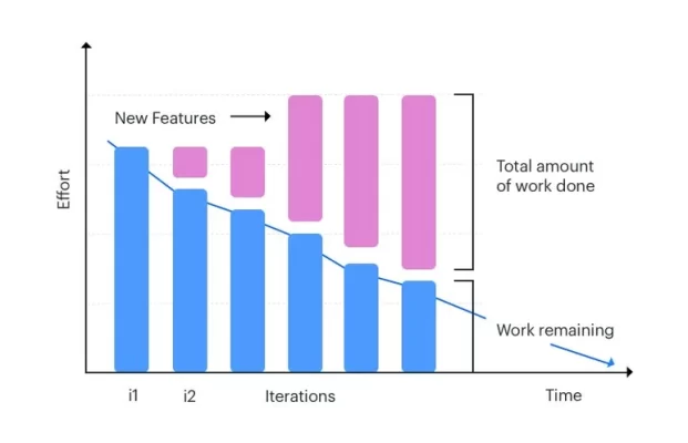
The burndown chart features several elements. The user story points are shown vertically and time/iteration—horizontal—shown using its axes. A project starts on the leftmost point, also the highest part of an ideal burndown chart. The rightmost point on your graph marks the end of your sprint or project.
Many burndown charts show an optimal work remaining line either dotted or using another color. This line provides a measuring yard to evaluate your performance and estimates team performance using historical performance. The continuous slope of the ideal work line is one unique characteristic. Teams actually operate at several speeds over the project.
On a burndown chart, the actual work line shows the project’s true advancement. Although the origin of the real and ideal work lines is the same, depending on the circumstances the actual line either rises above or below the ideal line. Your project is behind if the actual line is above the ideal line. Likewise, your project is ahead of time if the real line is below the ideal one.
The Advantages of Applying Burndown Charts
The simplicity and adaptability of the burndown chart define it most importantly. This chart can help you find a lot of information even in cases of less than perfect conditions for your project. The chart also shows a straight comparison between the intended and actual development, thereby enabling you to instantly identify whether your strategy is not working.
Effective teamwork is much enhanced by the visual aid burndown charts provide. Managers have to keep everyone on the same page and in the loop. Everyone can keep track simply with a burndown chart since it offers status data and does not take too much time to create and view.
Additionally, quite useful for team members is a burndown chart as a motivating tool. It keeps everyone engaged, and the continuous comparison with optimum performance on the graph motivates members to act regularly. Usually the center of the room in most agile companies, the burndown chart is very important since it keeps everyone informed and attentive to their roles.
Burndown Charts vs Burn-Up Charts
Another often used tool for project visualization is burn-up charts. Burn-up charts have the same coordinate system, hence they resemble burndown charts. Still, a burndown chart indicates all the remaining work, and burn-up charts indicate your current level of success.
Burn-up charts start from the bottom and move upward, unlike burndown charts that go down. Burn-up charts also show how far your product deviates from the need on a distinct scope line. The burn-up chart’s progress line for a successful project matches its end’s scope line.
Simplicity is where burndown charts shine due to their method. But burn-up charts provide additional information and can indicate prior changes in scope. Only changes in features and scope will be registered by burndown charts when the iteration is finished. Burn-up charts help you to organize for scope modifications and boost your efforts toward the deadline.